# read in your packages here
library(tidyverse) # general use
library(here) # file organization
library(janitor) # cleaning data frames
library(readxl) # reading excel files
library(scales) # modifying axis labels
library(ggeffects) # getting model predictions
library(MuMIn) # model selection

# read in your data here

drought_exp <- read_xlsx( # using xslx function
  here( # relative file path; using here to point where the data is in our repo
    "data",
    "Valliere_etal_EcoApps_Data.xlsx"
  ),
  sheet = "First Harvest" # read in first sheet of excel file; first sheet is the one we wanna look at
) Workshop 8 TEMPLATE
9 AM
In this workshop, we will answer the question: How do specific leaf area, water treatment, and species influence plant mass?
Specific leaf area is a continuous variable measured in cm2/g.
Water treatment is a categorical variable (i.e. a factor) with 2 levels: drought stressed (DS) and well watered (WW).
Species is a categorical variable (again, a factor) with 6 levels.
| Species name | Species code | Common name |
|---|---|---|
| Encelia californica | ENCCAL | Bush sunflower |
| Eschscholzia californica | ESCCAL | California poppy |
| Penstemon centranthifolius | PENCEN | Scarlet bugler |
| Grindelia camporums | GRINCAM | Gumweed |
| Salvia leucophylla | SALLEU | Purple sage |
| Stipa pulchra | STIPUL | Purple needlegrass |
| Lotus scoparius | LOTSCO | Deerweed |
1. Set up
# storing colors to use for species
lotsco_col <- "#E69512"
pencen_col <- "#D6264F"
salleu_col <- "#6D397D"
enccal_col <- "#3A5565"
stipul_col <- "#3F564F"
esccal_col <- "#515481"
gricam_col <- "#6C91BD"

# storing colors to use for water treatments
ds_col <- "#A62F03"
ww_col <- "#045CB4"

# storing a ggplot theme (that will be used for all ggplots)
theme_set(theme_bw())
2. Clean data
Data source: Valliere, Justin; Zhang, Jacqueline; Sharifi, M.; Rundel, Philip (2019). Data from: Can we condition native plants to increase drought tolerance and improve restoration success? [Dataset]. Dryad. https://doi.org/10.5061/dryad.v0861f7
# create a new object for clean data
drought_exp_clean <- drought_exp |>
  # cleaning column names
  clean_names() |>
  # creating a column for new species names
  mutate(species_name = case_match(
    species,
    "ENCCAL" ~ "Encelia californica", # bush sunflower
    "ESCCAL" ~ "Eschscholzia californica", # California poppy
    "PENCEN" ~ "Penstemon centranthifolius", # Scarlet bugler
    "GRICAM" ~ "Grindelia camporum", # Gumweed
    "SALLEU" ~ "Salvia leucophylla", # purple sage
    "STIPUL" ~ "Stipa pulchra", # purple needlegrass
    "LOTSCO" ~ "Lotus scoparius" # deerweed
  )) |>
  # creating new column for full  treatment names
  mutate(water_treatment = case_match(
    water,
    "WW" ~ "Well watered",
    "DS" ~ "Drought stressed"
  ))  |>
  # made species_name and water_treatment a factor and set levels
  mutate(species_name = as_factor(species_name),
         species_name = fct_relevel(species_name,
                                    "Lotus scoparius",
                                    "Penstemon centranthifolius",
                                    "Salvia leucophylla",
                                    "Encelia californica",
                                    "Stipa pulchra",
                                    "Eschscholzia californica",
                                    "Grindelia camporum")) |>
  mutate(water_treatment = as_factor(water_treatment),
         water_treatment = fct_relevel(water_treatment,
                                       "Drought stressed",
                                       "Well watered")) |>
  # selecting columns of interest
  select(species_name, water_treatment, sla, total_g)
Insert code to double check the structure of the data frame here.
str(drought_exp_clean)tibble [70 × 4] (S3: tbl_df/tbl/data.frame)
$ species_name : Factor w/ 7 levels "Lotus scoparius",..: 4 4 4 4 4 4 4 4 4 4 ...
$ water_treatment: Factor w/ 2 levels "Drought stressed",..: 2 2 2 2 2 1 1 1 1 1 ...
$ sla : num [1:70] 170 215 209 216 222 ...
$ total_g : num [1:70] 0.455 0.329 0.45 0.359 0.352 ...Insert code to display 10 random rows from the data frame here.
slice_sample(
  drought_exp_clean,
  n = 10
)
# A tibble: 10 × 4
species_name water_treatment sla total_g
<fct> <fct> <dbl> <dbl>
1 Salvia leucophylla Drought stressed 99.7 0.227
2 Encelia californica Well watered 222. 0.352
3 Lotus scoparius Drought stressed 90.9 0.0796
4 Stipa pulchra Drought stressed 176. 0.181
5 Salvia leucophylla Well watered 113. 0.195
6 Salvia leucophylla Well watered 127. 0.258
7 Lotus scoparius Drought stressed 91.4 0.0626
8 Penstemon centranthifolius Drought stressed 146. 0.126
9 Penstemon centranthifolius Well watered 129. 0.220
10 Encelia californica Drought stressed 196. 0.239 3. Visualizing data
What is the relationship between SLA and plant mass?
Make a scatterplot to visualize SLA (the predictor) on the x-axis, and total mass (the response) on the y-axis.
Label the axes with units where appropriate.
Add a title describing the relationship (e.g. as SLA increases, total mass ______).
ggplot(data = drought_exp_clean,
       aes(x = sla,
           y = total_g)) +
  geom_point(color = "forestgreen") +
  labs(x = "Specific leaf area (cm\U00B2/g)",
       y = "Plant mass (g)",
       title = "As SLA increases, total mass also increases") +
  theme(plot.title.position = "plot")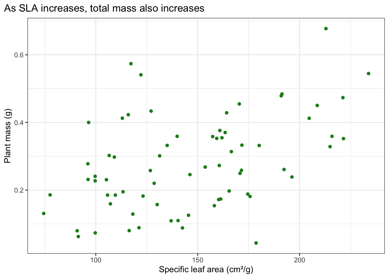
What are the differences in total mass between water treatments?
Make a jitterplot to visualize the differences in plant mass between water treatments.
Label the axes with units where appropriate.
Add a title describing the differences in (mean or median) plant mass between water treatments.
ggplot(data = drought_exp_clean,
      aes(x = water_treatment,
          y = total_g,
          color = water_treatment)) +
  geom_jitter(height = 0,
              width = 0.3) +
  scale_color_manual(values = c(
    "Drought stressed" = ds_col,
    "Well watrered" = ww_col
  )) +
  labs(x = "Treatment",
       y = "Plant Mass (g)",
       title = "Well watered plants have more mass than drought stressed plants") +
  theme(legend.position = "none",
        plot.title.position = "plot")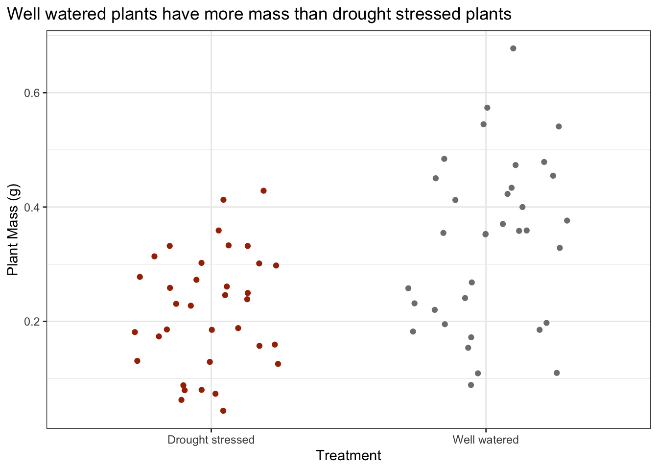
What are the differences in total mass between species?
Make a jitterplot to visualize the differences in plant mass between species.
Label the axes with units where appropriate.
Add a title describing the differences in (mean or median) plant mass between species.
Bonus: order the x-axis by decreasing mean plant mass and wrap the long species names using the label_wrap() function from the scales package.
ggplot(data = drought_exp_clean,
       aes(x = reorder(species_name, -total_g), # reorder a factor,
           y = total_g,
           color = species_name)) +
  geom_jitter(height = 0,
              width = 0.2) +
  scale_color_manual(values = c(
    "Grindelia camporum" = gricam_col,
    "Eschscholzia californica" = esccal_col,
    "Stipa pulchra" = stipul_col,
    "Encelia californica" = enccal_col,
    "Salvia leucophylla" = salleu_col,
    "Penstemon centranthifolius" = pencen_col,
    "Lotus scoparius" = lotsco_col
  )) +
  scale_x_discrete(labels = label_wrap(10)) +
  labs( x = "Species",
        y = "Plant mass (g)",
        title = "Plant mass differs across species") +
theme(legend.position = "none") 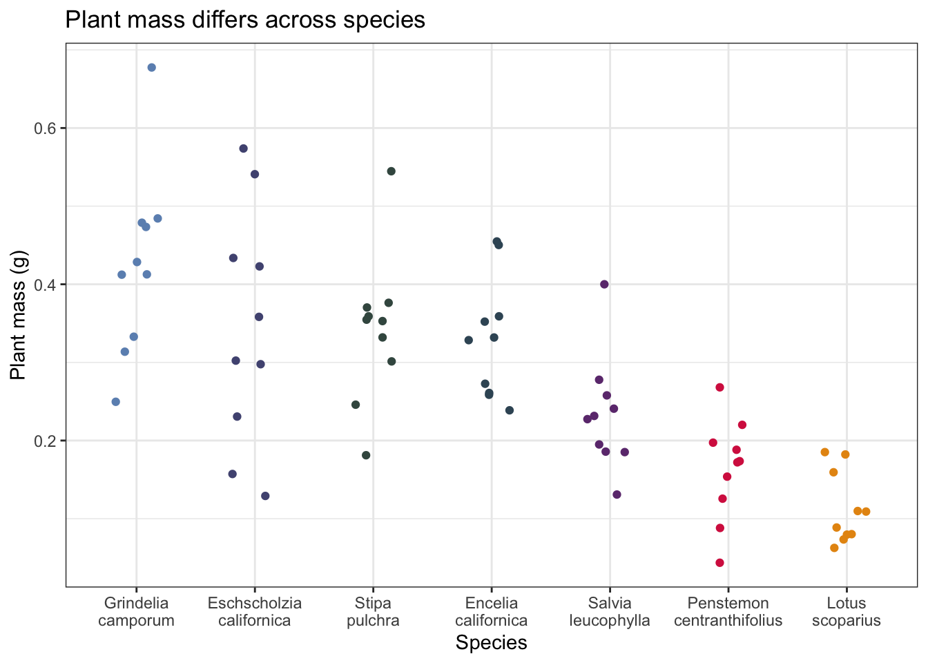
4. Fitting models
8 models total:
| Model number | SLA | Water treatment | Species | Predictor list |
|---|---|---|---|---|
| 0 | no predictors (null model) | |||
| 1 | X | X | X | all predictors (full model) |
| 2 | X | X | SLA and water treatment | |
| 3 | X | X | SLA and species | |
| 4 | X | X | water treatment and species | |
| 5 | X | SLA | ||
| 6 | X | water treatment | ||
| 7 | X | species |
Model fitting
# model 0: null model

model0 <- lm(
  total_g ~ 1,
  data = drought_exp_clean
)

# model 1: all predictors

model1 <- lm(
  total_g ~ sla + water_treatment + species_name,
  data = drought_exp_clean
)

# model 2: SLA and water treatment

model2 <- lm(
  total_g ~ sla + water_treatment,
  data = drought_exp_clean)

# model 3: SLA and species

model3 <- lm(
  total_g ~ sla + species_name,
  data = drought_exp_clean
)

# model 4: water treatment and species

model4 <- lm(
  total_g ~ water_treatment + species_name,
  data = drought_exp_clean
)

# model 5: SLA

model5 <- lm(
  total_g ~ sla,
  data = drought_exp_clean
)

# model 6: water treatment

model6 <- lm(
  total_g ~ water_treatment,
  data = drought_exp_clean
)

# model 7: species

model7 <- lm(
  total_g ~ species_name,
  data = drought_exp_clean
)
Model selection
Insert code to use the AICc() function to calculate the AIC for each model.
Arrange by decreasing AIC.
AICc(
  model0,
  model1,
  model2,
  model3,
  model4,
  model5,
  model6,
  model7
) |>
  arrange(AICc) # arrange by descending AICc
df AICc
model4 9 -156.19595
model1 10 -153.75361
model3 9 -124.07569
model7 8 -120.30191
model2 4 -95.82521
model5 3 -88.85180
model6 3 -86.76661
model0 2 -74.98036model4 is the best model because it has the lowest AICc, and best describes the variation in plant mass. In this particular scenario the best predictors that describe variation in plant mass (g) are water treatment and species, not specific leaf area.
Model diagnostics
Insert code to look at the diagnostic plots for the best model.
par(mfrow = c(2, 2)) # displays plots in 2x2 grid
plot(model4) # plotting model 4 diagnostic plots 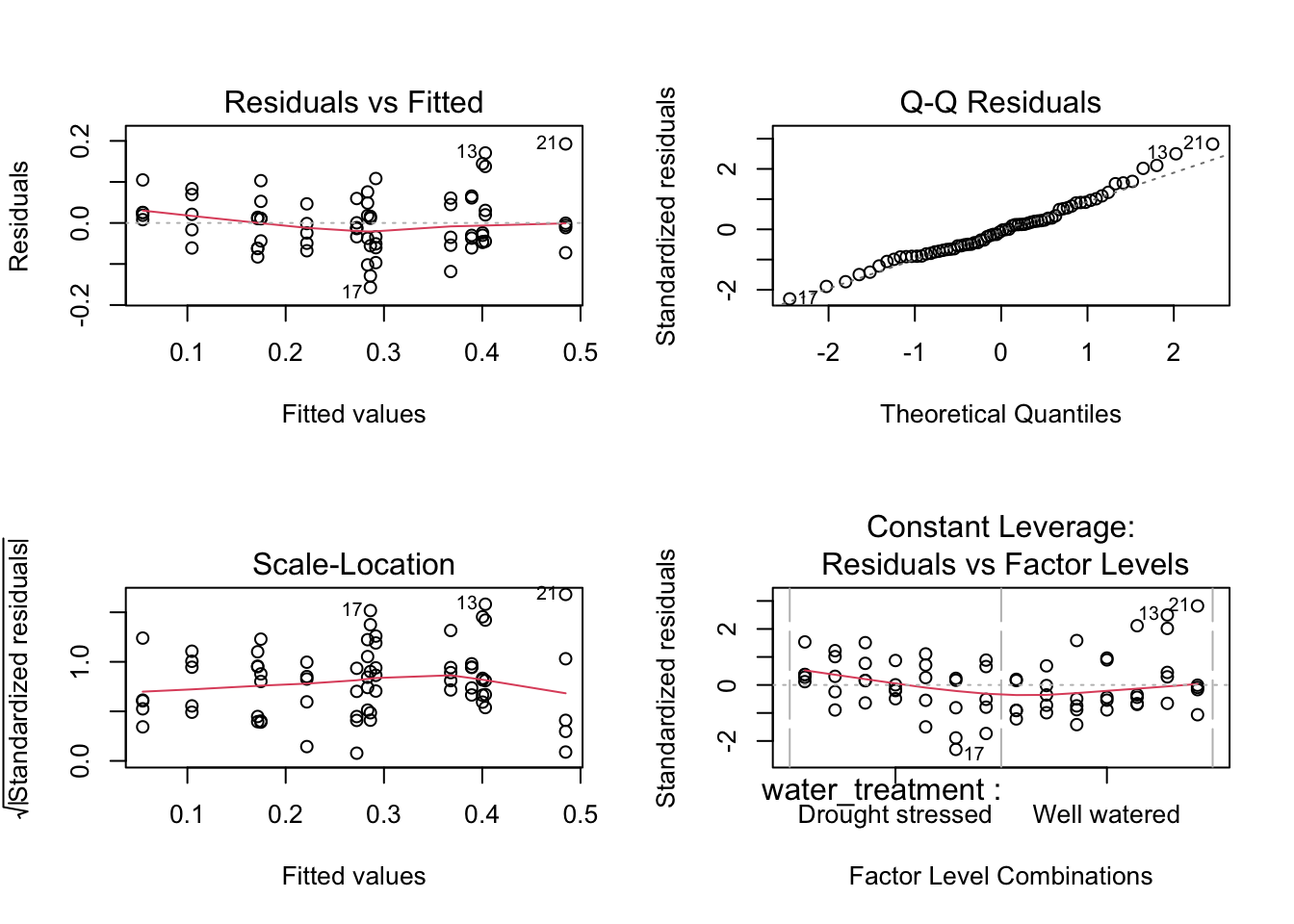
Diagnotsic plots look good.
Resaiduals (standing in for errors) look normally distributed based on QQ plot.
Residuals look homoscedastic (have constant avariance) based on Residuals vs. Fitted plot and Scale-Location plot.
No outliers influencing model estimates of coefficients.
Summary
Insert code to display the summary for the best model.
summary(model4)
Call:
lm(formula = total_g ~ water_treatment + species_name, data = drought_exp_clean)

Residuals:
      Min        1Q    Median        3Q       Max
-0.157087 -0.046953 -0.003733  0.041244  0.192657

Coefficients:
                                       Estimate Std. Error t value Pr(>|t|)
(Intercept)                             0.05455    0.02451   2.225  0.02973 *
water_treatmentWell watered             0.11695    0.01733   6.746 5.90e-09 ***
species_namePenstemon centranthifolius  0.05003    0.03243   1.543  0.12799
species_nameSalvia leucophylla          0.12020    0.03243   3.706  0.00045 ***
species_nameEncelia californica         0.21774    0.03243   6.714 6.70e-09 ***
species_nameStipa pulchra               0.22881    0.03243   7.055 1.72e-09 ***
species_nameEschscholzia californica    0.23164    0.03243   7.143 1.22e-09 ***
species_nameGrindelia camporum          0.31335    0.03243   9.662 5.53e-14 ***
---
Signif. codes:  0 '***' 0.001 '**' 0.01 '*' 0.05 '.' 0.1 ' ' 1

Residual standard error: 0.07252 on 62 degrees of freedom
Multiple R-squared:  0.7535,    Adjusted R-squared:  0.7257
F-statistic: 27.08 on 7 and 62 DF,  p-value: < 2.2e-16
What are the reference levels? (whatever doesnt show up)
Drought stressed is the reference level for treatment. (has the lowest mass compared to well-watered)
Lotus scoparius is the rference for species (has the lowest mass of all the species)
What does the (Intercept) represent?
What does water_treatmentWell watered represent?
What does species_namePenstemon centranthifolius represent?
What does species_nameEschscholzia californica represent?
Stop and think: what does this model mean?
What is the best model?
The best model includes water treatment and species as predictors
How much variation in the response (total mass, in grams) does this model explain?
this kodels explains 72% of the variation in plant mass.
How do we interpret the effects of the predictors on the response variable (again, total mass in grams)?
Plant mass differs across water treatments and species.
4. Model predictions
Insert code to generate model predictions for the best model.
Rename the x column and group column to match the original data frame (drought_exp_clean).
Look at the object before plotting.
preds <- ggpredict(
  model4, # model object
  terms = c("water_treatment", "species_name") # predictors
) |>
  # rename columns
  rename(water_treatment = x,
         species_name = group)

# each row represents a model prediction for the mean plant mass for a species in a given water treatment
5. Final figure
Create a clean, publication ready figure depicting predictions for the best model and the underlying data.
ggplot(data = drought_exp_clean,
       aes(x = water_treatment,
           y = total_g,
           color = water_treatment)) +
  geom_jitter(height = 0,
              width = 0.2,
              alpha = 0.5, # slightly transparent
              shape = 21) + # use open circle
  geom_pointrange(data = preds,
                  aes(x = water_treatment,
                      y = predicted,
                      ymin = conf.low,
                      ymax = conf.high)) +
  scale_color_manual(values = c(
    "Drought Stressed" = ds_col,
    "Well watered" = ww_col
  )) +
  stat_summary(fun = mean,
               geom = "point",
               color = "red",
               size = 2) +
  scale_x_discrete(labels = label_wrap(10)) +
  labs(x = "Treatment",
       y = "Plant mass (g)") +
  facet_wrap(~ species_name,
             nrow = 1) + # everything on the same row
  theme(legend.position = "none")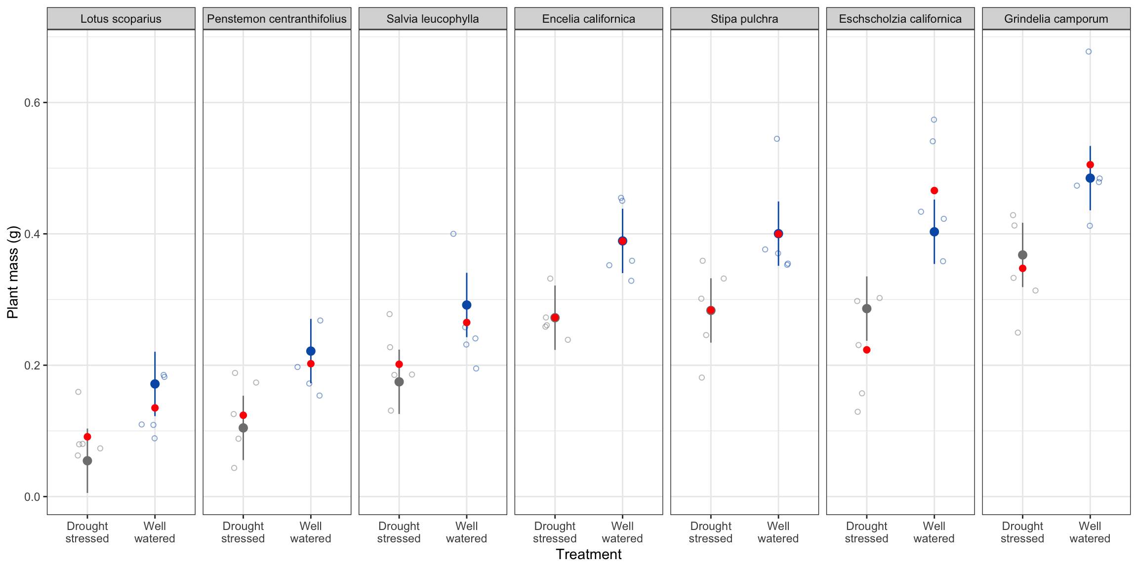
means are in red, model predictions are in black. reason the means are different than predictions is because the predictions take into account the different species and treatments. model accounts for variation in other species.
6. Writing
Figure caption
Figure 4. Plant mass (g) differs accross species and treatments. Open circles represent individuals in each treatment (red: drought stressed, blue: well watered). Panels depict different species. Opaque points represent model predictions for plant mass, and bars represemnt a 95% confidence intervals of model predictions. Data source: Valliere, Justin; Zhang, Jacqueline; Sharifi, M.; Rundel, Philip (2019). Data from: Can we condition native plants to increase drought tolerance and improve restoration success? [Dataset]. Dryad. https://doi.org/10.5061/dryad.v0861f7
Basic components of test
predictors
treatment and species
response
plant mass (g)
test
linear model (multiple linear regression)
distribution
F
parameters (degrees of freedom)
7, 62
test statistic (f-stat) 27.08
R2
0.73
p-value
p < 0.001
significance level
\(\alpha\) = 0.05
reference level(s)
Drought stressed, and well watered
Written communication
Methods
We used linear models to determine the predictive relationship bnetween specific leaf area (cm2/g), treatment, and species on plant mass (g). We chose the simplest model that explained the most variation in plant mass using Akaike’s Information Criterion (AIC). We evaluated model assumptions for the simpolest model chosen using AIC forof normally distributed errors (residuals) using QQ plots and homoscedastic erros (errors) using Residuals vs Fitted and Scale-Locations plots.
Goal of analysis
Model selection
Model diagnostics
Results
We found that the simplest model decribing variation and plant mass included species and treatment (linear model: F(7, 62) = 27.08, p < 0.001, \(\alpha\) = 0.05, adjusted R2 = 0.73).